Jiangxi Changnan Construction Group Co., Ltd. was born in Nanchang, a beautiful hero city on the Bank of Ganjiang River in 1969. Since its establishment, the company has always adhered to the road of innovation and development, and has become a national construction engineering construction general contractor with special qualification. It has won the Luban Award, the highest award of China's Construction Engineering, and has been awarded the "national excellent construction enterprise" for many times. It has been in the forefront of the top 100 private enterprises in Jiangxi Province for many years.
The visual identification system of Changnan construction group is the external form of corporate culture construction of Changnan construction group. It is a visual symbol that transmits the values, management concepts and behavior norms advocated by the enterprise to the public through a series of image design.

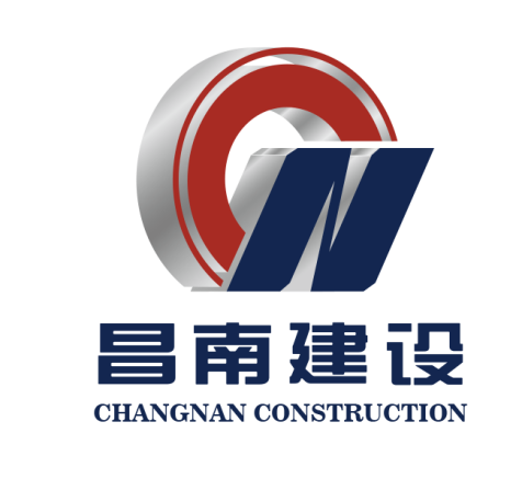
The logo creation is closely related to the enterprise name "Changnan construction", which contains the enterprise vision and mission. It is beautiful, atmospheric and stable, and the brand image is perfectly presented.
The logo consists of the letter "CN". "CN" is not only the first letter of "Changnan", but also the two key letters in China's abbreviation "China". It is also China's national domain name.
The red "C" in the logo looks like a rainbow, which means that the group aims to create a harmonious life and draw a beautiful blueprint for its customers. The blue "n" is like a beautiful "twin tower" building, which shows that Changnan people uphold the spirit of Luban and express the pursuit and determination of more excellent architectural works in the north and south of the river.
The color of "red" shows passion and enthusiasm, which implies the bright future of the group's business; the color of "blue" represents technology and wisdom, and shows the calm and steady visual image of the enterprise.